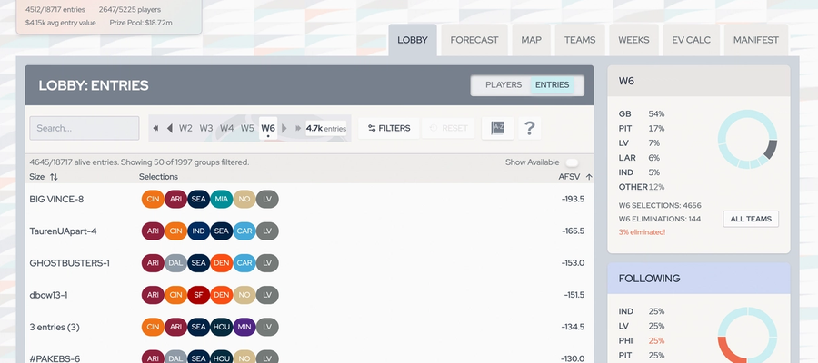
Focus. Lightness. Objectivity. When we set out to redesign Survivor Atlas this spring, these attributes were at the top of the list. We wanted to differentiate ourselves from other sports betting analytics sites that are either over-the-top with NFL branding or slightly undercooked in terms of style. We don't mind getting cute sometimes (especially at the holidays) but only if it's not too distracting. All in all, we wanted to present our newly expanded tools in a clear and chill way, so that you could enjoy swimming in the data while minimizing bias and emotional choices.
- We eschew team logos and outside branding.
While many sport analytics sites employ NFL logos to identify teams, we felt this would be a distraction both in terms of users’ own team allegiances and general visual clarity. So, for Survivor Atlas, we elected early on to use a 2- or 3-character abbreviation on a single-color bubble for each team. Given how quickly lingo gets established in the sports world, we were confident that this lexicon would be easily absorbed. Plus, the Circa Leaderboard gets wild enough as it is.
This approach with the coherent team bubbles was also easier to design around formally vs. working with team logos of various shapes and sizes. - We embrace subtle color shifts and gradients.
Rather than splashing super high contrast and shine around the pages of the Survivor Atlas site, we aimed for subtle variation between layers. The color palette around our data uses a mix of mostly soft grays and off-whites, with contrasting text, and the brightest backgrounds utilized behind the central data points of each page and section. Darker backgrounds go with organizing information. Gradients and our aqua accent go with buttons or highlight special information. We want you to taste the rainbow of survivor success, but in our site’s interface we try to reserve it for special occasions, and keep most things neutral. Like your calculations. - We inject more fun around the map.
(we don’t call this tab an atlas... the whole site is the atlas, duh)
In our experience as players, and our observation of analytics, users spend a large percentage of time looking at the map over the season. So this is where we added more flair, options, and animation, such as the anchor drop when you make a selection, and the red “treasure lines” between adjacent picks (but you can disable these in map controls if you prefer).
Feedback about what helps our users see and play clearly is always welcome. We also enjoy seeing demos of how YOU use the tools or combine them with other resources. Later in the season we plan to publish a complete style guide, both to cement our brand and facilitate future collaborations.

